
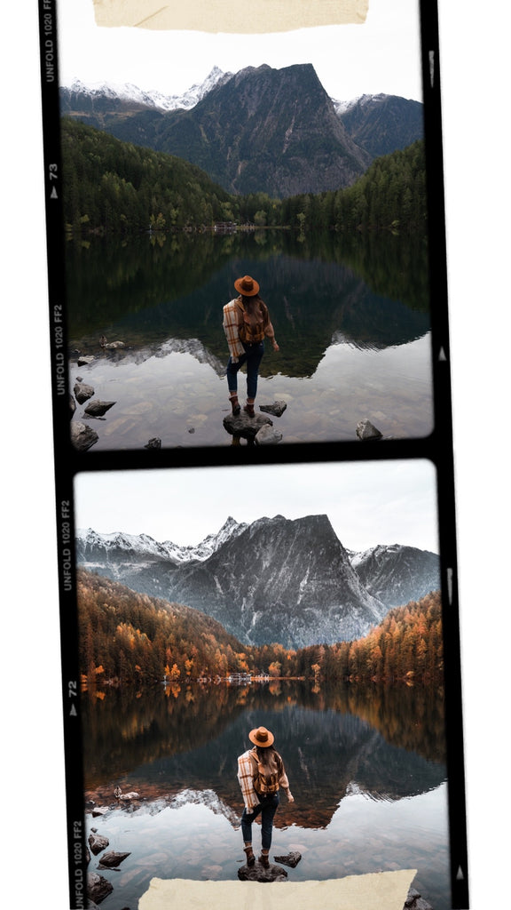
HOW TO CREATE FALL COLORS ON YOUR PHOTOS
Something you might be wondering in this autumn season is how does everyone have these awesome fall colors on their photos and I am not ? Well the truth is sometimes they do have bright and beautiful colors and sometimes they don't and they need to be boosted. You can now know everything about fall color boosting, and that is the perfect time to know how using Lightroom
USING LIGHTROOM
Lightroom is very simple to use when it comes to edit the colors and lighting in your photos. I will show you my tricks for the ultimate natural result recreating fall colors.
I would highly recommend you to shoot in RAW to get a nice margin of adjustments on your photo if you want an optimum result.
If you are a Mobile user check out my mobile tutorial
DESKTOP EDITING USING LIGHTROOM CLASSIC (LRC)

If you edit on desktop you can have fun creating this look in Lightroom Classic and explore your own creativity.
- To start off I always crop my photo to 4x5 if I intend to post it for Instagram. There is no need to edit parts that will never show up in the end. Plus this help me choose which photo renders the most once cropped to fit Instagram format.
- Then I make sure to straighten my photo with the horizon. I usually like to use the little Ruler this really make it more simple to have a straight photo.
STEP N.1 : EDIT YOUR PHOTO THE WAY YOU LIKE IT OR USE A PRESET AND ADJUST IT.

If you already know the style you want to go for edit your photo using the basic settings and the color and tones settings. Or use a preset to find inspiration or to give you a base of editing.
I highly recommend to always adjust your preset so that it fits 100% your photo. These slight adjustments are really what makes a difference between a good and awesome editing.
So go ahead tweak this white balance and exposure, correct the skin tone if necessary and create on the basic editing of your photo until you are happy with the result.
Tip : For a fall look I like to have a warmer white balance as this will help me boost the leaves in the trees to the yellow, golden and red side. If I go for a cold look it will be much harder to have a natural result.
STEP N.2: HSL (HUE / SATURATION / LUMINANCE)
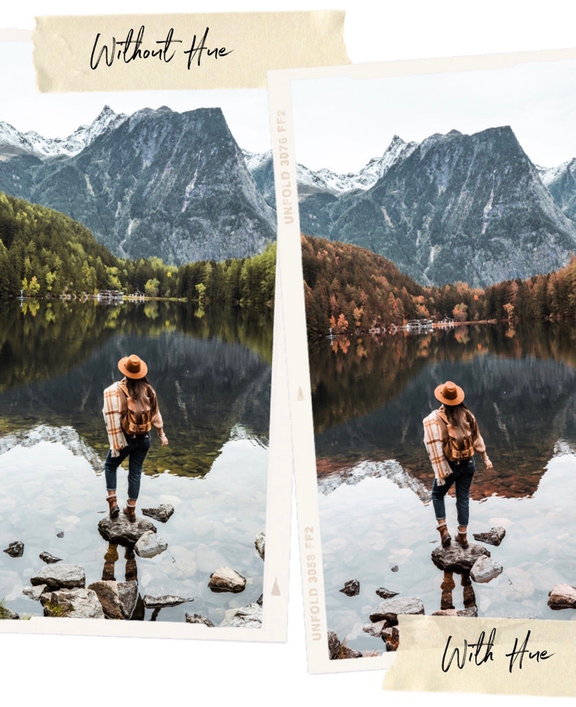
HSL helps adjusting the colors in your photo. The important thing to know here is that Lightroom registers the green of nature as yellow most of the time.
- Use the HUE tool and make sure you set the green tones to the yellow side and the yellows to the orange side.
- This will turn your leaves into autumn mode. Try to avoid boosting the effects to 100% except if you see that it doesn't impact the photo too much and that it stays natural.
- As a personal touch I like to keep the saturation and luminance of the greens low to keep it natural.
STEP N.3: CHECK THE CALIBRATION AT THE BOTTOM

Calibration is setting the colors rules on your photo. If the basic editing you did is not getting close to what you had in mind then you can use the calibration to get closer to fall colors. Lower the opposite color of what you want to create and adjust the saturation below it for a more natural result.
In our case to create an orange boost on your photo you will lower the teal/blue cursor (as blue and orange are opposite colors on the color wheel). This will get the orange tones to pop up in your photo.
I personally only use this tool if me previous editing was not enough. You will see that calibration gives you a very fast result but that it looks very fake. This is why I only slightly tweak it to help me create a more natural result.
STEP N.4 : USE THE LOCAL TOOLS
Local tools will make a huge difference in your photos, keep in mind that the more you add the less your photo will look natural. Try to respect the natural light coming sources on the photo and to use the tools softly to have the maximum natural result.
THE BRUSH

This is the most precise tool you can use, I like to set up different settings for different brushes. With them I create depth light and colors locally to boost the leaves in my photo.
- I use a brush with more exposure and I paint over the top of some trees where the light seems to catch up already I do it until it gives me depth in my photo.
- I can also add contrast if my leaves look very flat to bring more texture.
- I use a brush boosting the white balance and I paint over some trees to warm them
- I use a brush with more saturation to get some other trees to have pop colors.
The trick it to not paint over the whole foliage but to slightly paint some trees here and there with these different brushes, sometimes painting them on top of each other for a maximum natural effect.
THE RADIAL FILTER

I use this filter with 2 adjustments : I tick the inverted effect and I always use a 100% feather effect to have the effect applying inside my circle and not outside of it + with a natural fading.
- With this tool I like to warm up some areas or boosting a light coming source to bring more dimension to me photo.
THE GRADUAL FILTER

- It helps you frame the photo lowering down the exposure
- You can also bring back the informations in the sky and keep the rest of the photo untouched.
I hope you learned something today and that you feel now confident you will be able to have beautiful autumn colors on your photos as well. Even if mother nature decided she was not ready yet.
See you soon